Zoe Claymore Garden Design
Zoe is an award-winning garden and landscape designer based in Richmond upon Thames, Greater London. She specialises in small to medium size residential gardens across London and Surrey. We collaborated with Zoe to create a new strategy, visual identity and brand stationery. The project extended to flyers, magazine advert, welcome brochure, invoice and estimate template, as well as a series of social media templates.
Sector
Garden Design
Expertise
Brand Strategy
Visual Identity
Print Design
Digital Design
Photography
Annabelle May
-
Zoe approached us on the back of a successful summer of RHS shows. She was in the early stages of her business and was attracting all sorts of clients with different budgets and goals. After picking up several awards and with many opportunities coming her way, Zoe wanted to build a brand that would elevate her services and represent who she is as a designer.
We wanted to help Zoe feel confident about her brand, in her messaging and visual identity. Zoe is passionate about spatial design, plants and the power of nature to enhance our everyday lives. We were involved in putting together the tagline ‘bringing people and plants together’. It represents the purpose of Zoe’s work, not only functionally but emotionally how her work makes clients feel about their outdoor space.
We developed the orange and green brand colours to create a more vibrant zesty colour palette to reflect Zoe’s warmth and fun approach to design. These statement colours create a unique identity that’s easily recognisable. To support this, we also created a secondary colour palette of grey, light grey and cream.
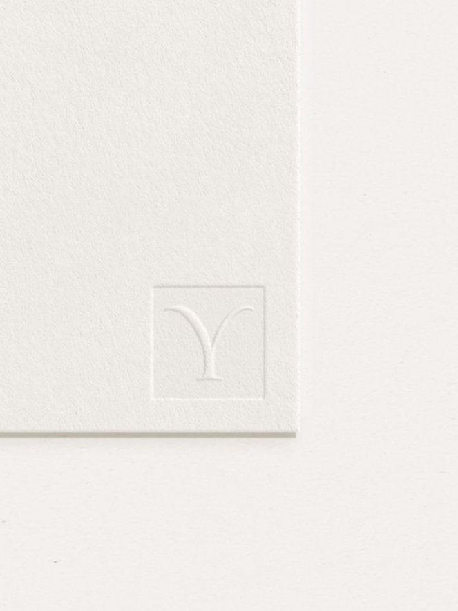
The logotype is a Roman style typeface characterised by vertical strokes. The fluidity of this font reflects the soft shapes and textures of plants. The brand mark concept is the ‘Y’ used in the wordmark. This can be used as a supporting icon, or as a decorative element for social media. The ‘Y’ embody characteristics that feel plantlike. It is inspired by nature, growth and sustainability which are important brand values.
The supporting graphics inject some personality and a sense of fun. The custom hand-drawn icons add a different dimension to the brand. They have a rustic quality about them that feels more personal and organic.